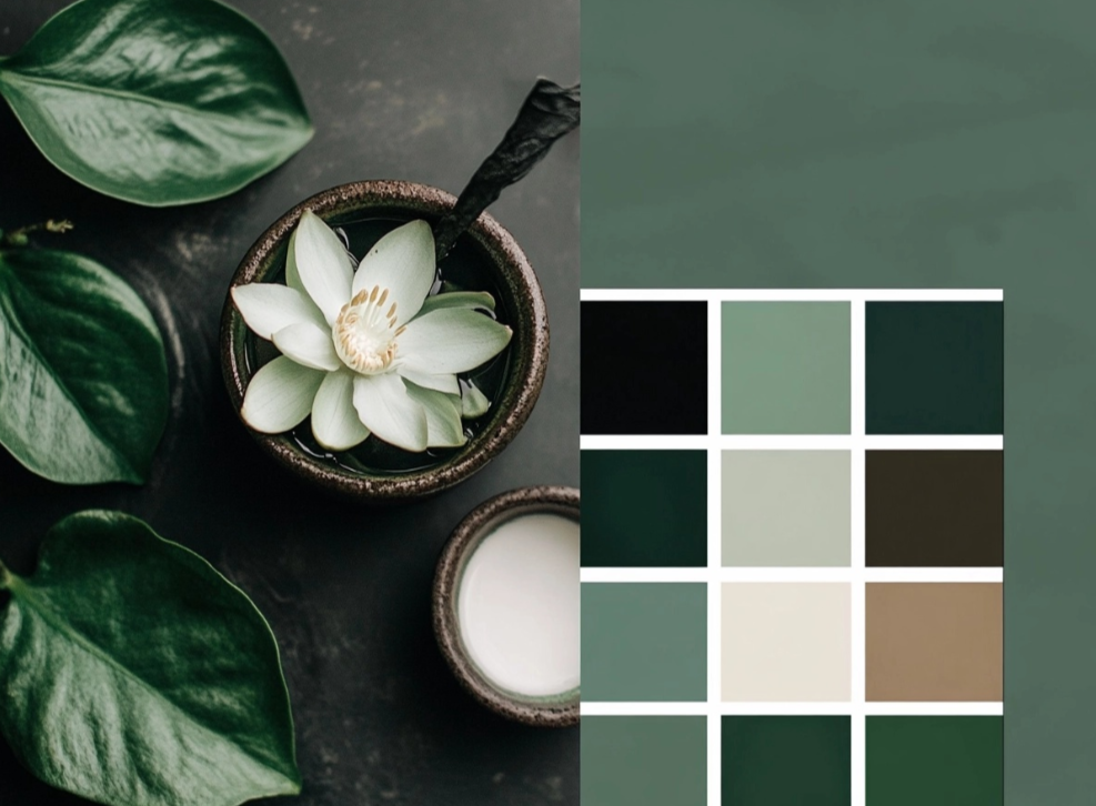
The Ultimate Guide To Choosing Interior Paint Colors

Choosing the right paint colors for your home’s interior can be both exciting and challenging. The colors you select will set the mood and atmosphere of your space, affecting everything from your daily emotions to the perceived size of your rooms.
In this comprehensive guide, we’ll walk you through the process of selecting the perfect color palette for your home, considering factors like lighting, room function, and color psychology.
Understanding Color Psychology Colors have a profound impact on our mood and behavior. Here’s how different colors can affect your space:
– Blue: Creates a sense of calm and tranquility – Green: Promotes harmony and balance – Yellow: Energizes and uplifts – Red: Stimulates and creates excitement – Purple: Adds luxury and sophistication – Neutral tones: Provide flexibility and timelessness
Consider Your Lighting Natural and artificial lighting can significantly impact how paint colors appear in your space:
– North-facing rooms: Choose warmer colors to counteract cool light – South-facing rooms: Any color works well due to consistent natural light – East-facing rooms: Colors appear brighter in the morning – West-facing rooms: Colors appear warmer in the evening
Room Function and Flow Different rooms serve different purposes, and your color choices should reflect this:
– Living rooms: Choose welcoming, conversational colors – Bedrooms: Opt for calming, restful tones – Kitchen: Select energizing, clean colors – Home office: Use focused, productive shades
Testing Your Colors Before committing to a color:
1. Get sample swatches 2. Paint large test patches 3. Observe colors at different times of day 4. Consider existing furnishings 5. Think about the overall flow between rooms
Professional Tips – Start with your largest room first – Use the 60-30-10 rule for color distribution – Consider the ceiling as your “fifth wall” – Don’t forget about trim and molding – Think about long-term appeal
Working with Neutrals Neutral colors provide a flexible foundation:
– White: Creates a clean, fresh canvas – Gray: Offers sophisticated versatility – Beige: Provides warmth and timelessness – Greige: Combines the best of gray and beige
Color Trends vs. Timeless Choices While it’s fun to follow trends, consider:
– Classic color combinations – Your personal style – Home’s architectural style – Resale value – Long-term satisfaction
Final Thoughts Choosing the right paint colors is a personal journey. Take your time, trust your instincts, and don’t be afraid to seek professional advice when needed.


